
Giving in and actually pasting this everywhere.
Think it’ll help?
Just a personal blog, kept since 2008.

Giving in and actually pasting this everywhere.
Think it’ll help?
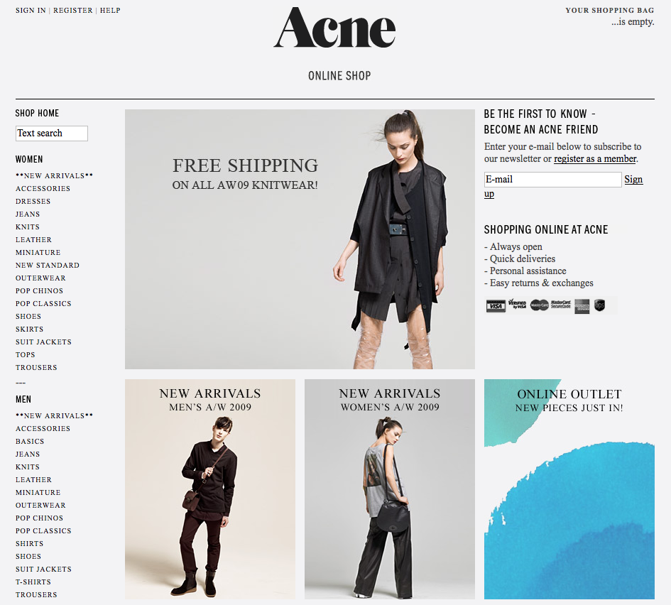
Acne’s online shop is beautiful.
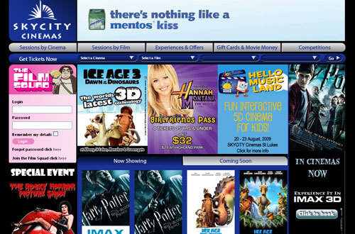
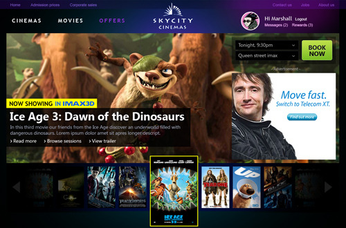

Oh boy, I loathe the Skycity Cinemas site with a mighty passion. I once emailed them about it with some friendly tips, and yes a bit of a whinge.
Why oh why did they think it was a good idea to slap on a poorly implemented bastard cousin of cover flow?
I did get a response to my rant:
“Thank you for providing your feedback on the Beta version of our new
website. As the site is set out a little differently it will take a
while to familiarize yourself with it and we understand that this can be
frustrating. Thank you for giving us your thoughts regarding the
difficulty you experienced while looking at our site.”
And that was April 2008. Ech.
Have you tried to browse that site mobile? Take my advice and just don’t.
Redesign – excellent idea. Send it!
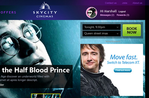
Marshall redesigns the Skycity cinemas website, a dramatic (and much needed) improvement. Send it in man, nice work.
Link: Gridmaker
Punch in width, height, number of columns, width of columns, guttering and even baseline.
Grid maker takes all this information and a little more and spits out a suitable grid. You can download your grid in PNG, but it’s also demonstrated in your browser window.
Link: The Ultimate Website Launch Checklist | Our Blog | Box UK
Smashing Magazine alerted me to this one. Something for me to read when I have something other than cotton wool in my head.