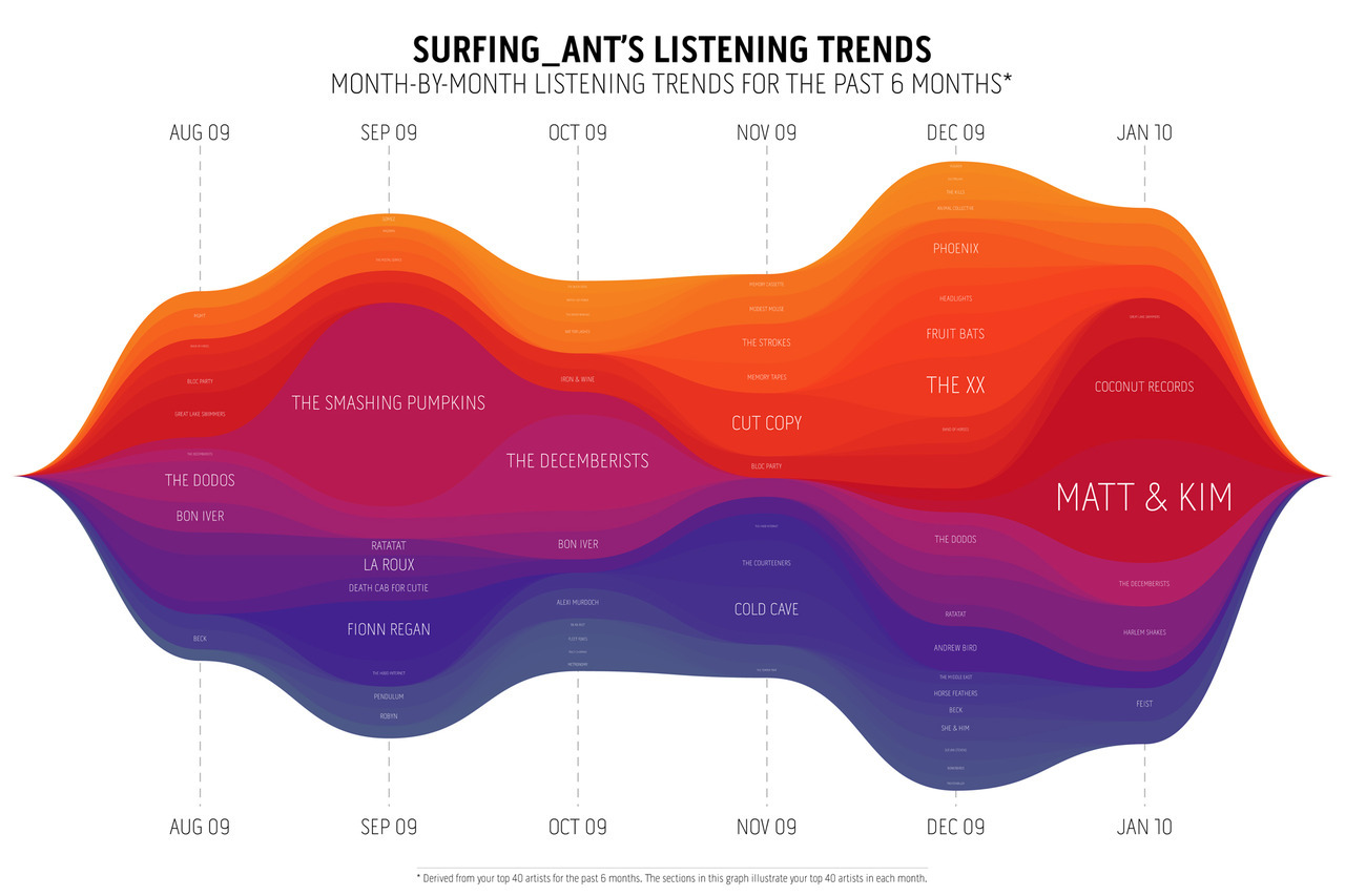
This stream graph visualisation shows your listening trends over the past 6 months. It’s derived from your top 40 artists listened to over this period.
I love last.fm. The last.fm playground has some new toys for subscribers, including visualisations and graphs of your listening habits.
You can compare your listening to your friends, find relationships between artists, explore the music tags that you scrobble frequently, check out an artists’ global saturation based on last.fm scrobbles and more. Most reports are available to download in PDF.
My favorite is the Listening Trends graph (pictured, click to biggerise it), you can compare your listening to specific users, all your last.fm friends, your last.fm neighbours, or just view your own data.
It’s possible to change the time period, and choose from three colour schemes, I went with the one using the most purple and pink of course. I think this would make a gorgeous poster – would be nice to be able to customise fonts and colour schemes, I’m sure that’s coming.