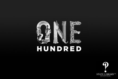
In celebration of their centenary, The State Library of New South Wales is releasing a typeface comprised of elements taken from items within their catalogue.
For each letter in the project, there is a summary of the texts and objects which have been used to create it, which is a great way of publicising the libraries’ collection.
Working closely with the State Library, Design agency Frost* came up with a way to take fragments of visuals of our collections and compose them into letters of the alphabet. This creative process began with O, U and T, and so began our campaign to take the Library OUT into the community.
Visit the centenary website to view the project.